
Looking for the Lighthouses
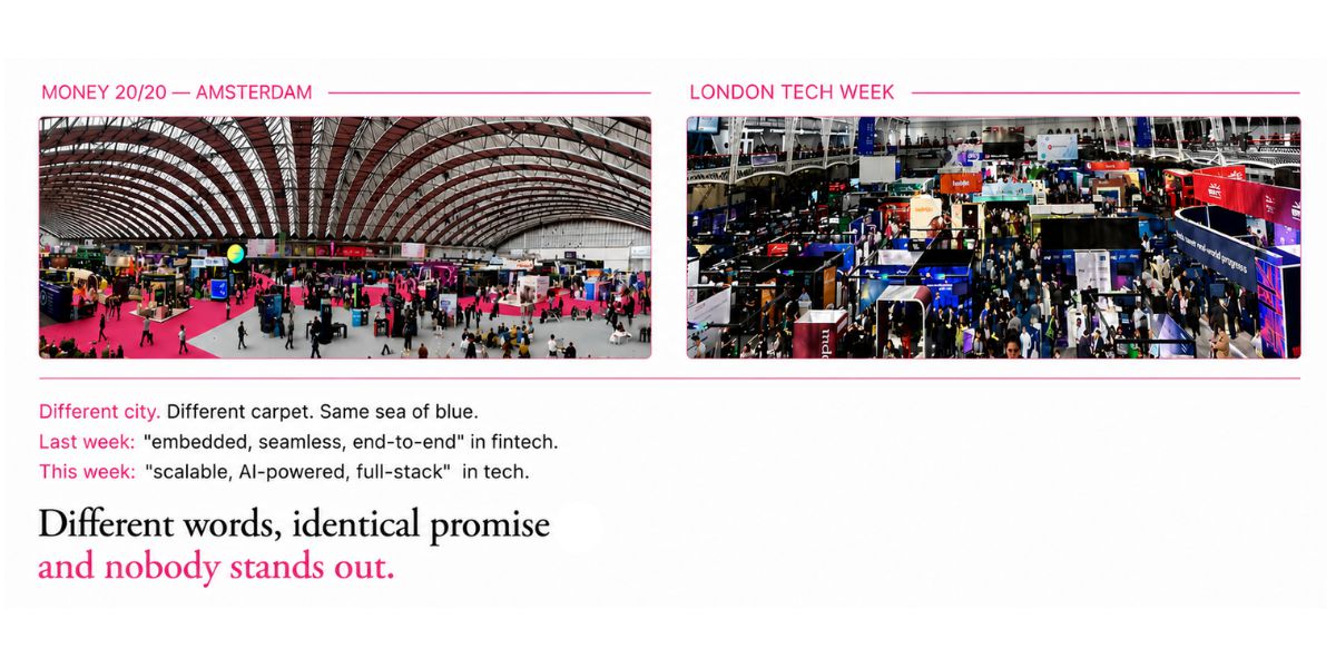
This industry has a color. You feel it before you can name it walking any payments hall – stand after stand, a wash of blue from the carpet to the lanyards. Sky blue, navy, that same confident corporate mid-blue. Hundreds of companies are spending real money to be there, and from ten feet away you cannot tell them apart.
I have watched it at Money20/20 in Amsterdam and Las Vegas, at London Tech Week, at every payments event in between. The venue changes. The palette does not.
I have been saying this out loud since 2024, and the reaction was always the same knowing nod. Everyone sees it. Nobody counts it.
So I put the question to FXC Intelligence, and it was a real question, not a rhetorical one. Is this a conference floor delusion – a trick of exhibition lighting and my own pattern-hunting – or is the industry genuinely this uniform?
Lucy Ingham and her team analyzed the brand palettes of 144 payments companies, taken from their websites and brand assets rather than their stands. Then, separately, the dominant color of 211 stands at Money20/20 Europe. The first dataset is the one that answers the question. The second is the one you can photograph.
It is not a conference problem. The numbers are worse than the nod suggested.
63% of payments brands carry blue in their core palette. 42% lead with it. On the show floor, blue dominated 36% of stands – but the palette figure is the one that matters, because it holds whether anyone is exhibiting or not.
Then it gets specific in a way that should stop you. Half of the blue-led brands sit within 20 RGB units of another brand in the same industry – close enough that you could not tell them apart unless you held them side by side. 13% are within 10 units, which is indistinguishable even then. For scale: the gap between a mid-blue and a mid-green is around 360 units.
And it is most extreme exactly where you would least expect it. 46% of the companies showcasing AI. 48% of the ones promoting stablecoins. The corners of this industry that sell themselves on being the future are the ones dressing most identically to each other.
Blue is a rational decision. That is the problem.
Nobody chose blue by accident. Blue conveys trust. It conveys belief. It is the color of the institution that will still be standing tomorrow, and in an industry where the entire product is trust, reaching for it is a defensible decision every single time.
The logic usually runs like this: the big brands are blue, the big brands are trusted, so some of that trust will rub off on us. A spillover effect, for the price of a hex code.
Every founder who makes that call is being rational. And the sum of all those rational decisions is a room where nobody can be told apart – including you.
It was never only the color. Walk the same floor and listen instead of look, and you get the verbal version of the same phenomenon. Reliable. Secure. Seamless. The same three words, attached to the same shade, by companies whose entire pitch is that they are different from the company at the next stand, who is also reliable, secure and seamless, and also blue.
The question that comes due eventually
Here is what I would ask, if I were sitting across from the founder or CEO of any company in that 63%. Not why did you choose blue – that answer is usually reasonable. The harder question is when were you planning to find out whether it matters.
Because there is a moment when it stops being a design conversation and becomes a diligence question. A banker building the deck for an IPO. An acquirer’s team doing brand due diligence before a term sheet. An investor in a Series C process asking, plainly, what makes this company defensible against the four others they are also looking at this quarter. Nobody asks that question at a normal Tuesday board meeting. Almost everybody gets asked it once, at the moment the company’s story has to hold up under someone else’s scrutiny, with real money behind the answer.
By then it is too late to build the answer. You can only report whether you already have one.
That is the timing problem underneath the color problem. Differentiation is treated as marketing’s job, on marketing’s clock, which means it competes with the launch, the campaign, the quarter that is already underway – and it loses, because nothing about this quarter’s plan requires it to win. It only becomes urgent retroactively, in the diligence room, when a founder is asked to explain in one sentence why this company and not the other twelve, and discovers the honest answer is a color.
So the challenge I would put to any CEO reading this is simple. Do not wait for the banker or the acquirer to ask the question. Ask it of your own company now, while you still have the runway to build a real answer instead of a rehearsed one. What do we actually compete on? Would a customer, unprompted, say what makes us different. If every word came off our website tonight, could a stranger still tell us apart from the company next door.
Ask it early enough and it is a strategy conversation. Ask it in the data room and it is a liability.
This is what I have been calling the Sea of Blue. It is the visible, photographable surface of something the industry has been living inside for years – the Sea of Sameness. And now we know how deep the water is.
The lighthouses
Here is what I actually look for when I walk a floor like that. Not the blue. The exceptions.
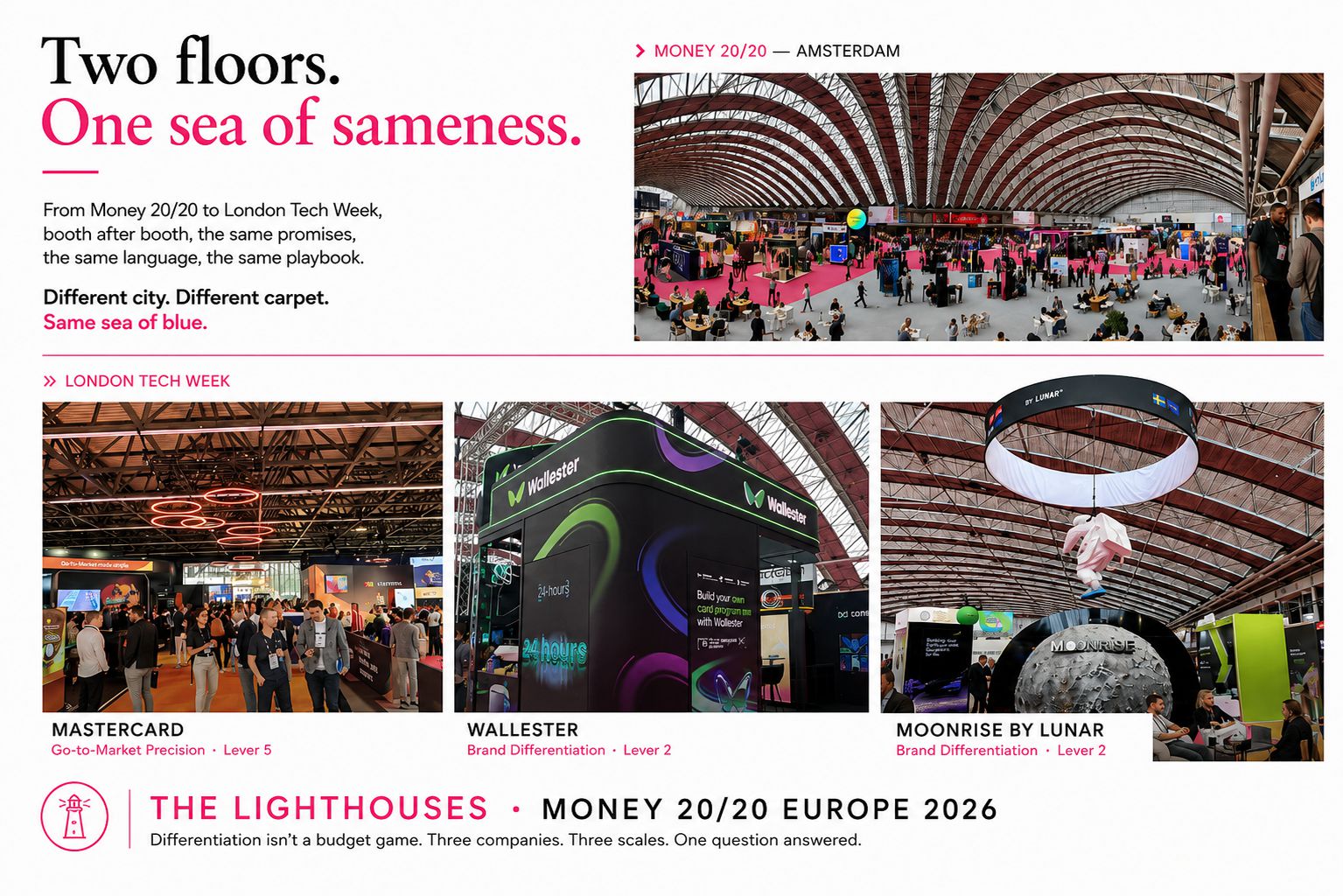
Because you can navigate a sea of blue. You look for the lighthouses the brands built to be seen from a distance, that do not move, that everything else on the water ends up orienting around. Three stopped me in Amsterdam this year. Deliberately three different scales, because the point is that this is not a budget game.
Mastercard, at the largest end. Orange and black, positioned so that crossing between the two halls meant going through them. You could not avoid the brand. And it has reached the point where the two interlocking circles do the entire job without the name attached – that is not a color choice, that is years of deliberate investment compounding into something a competitor cannot buy past in one conference cycle.
Wallester, a card issuing and payments platform, won on a single decision. Green, in a sea of blue, is eyecatching before you have read a word of it. And they paired it with activation on the ground – people in uniform, approaching you, doing the work. It is never one thing alone.
Moonrise by Lunar took the third route: story. A moon-themed experience you could stand inside, on a floor of rectangles. You think about where it takes you – the sky is not the limit.
One giant. One that won on a color. One that won on a story. The common factor is not budget. It is that all three decided, on purpose, to look and sound like themselves instead of like the category.
What the blue is actually telling you
The color is a symptom. I want to be precise about the condition underneath it, because that is where the money goes.
When a company reaches for the category’s color and the category’s words, what has usually happened is that the differentiation work never got done. Not refused – deferred. It is slower than execution, it is harder to brief, and there is always a launch in the way. So the brand borrows its positioning from the room it is standing in, and the palette follows, and the keywords follow, and by the time anyone notices, the company has paid a great deal of money to be indistinguishable.
That is the Differentiation Deficit. A company declining to invest in setting itself apart, and paying for that decision every time a buyer cannot tell it from the stand next door. The Sea of Blue is what the Deficit looks like from ten feet away.
And the economics run in one direction. If you make the choice to really differentiate from the beginning, and you invest behind it, that investment accelerates – it compounds, the way Mastercard’s two circles compounded into something you recognize without a word attached. If you bet on blue and you bet on the same words, you are not saving your marketing budget. You are depleting it, one rational decision at a time.
Which is the other reason this is not self-correcting. The tool most people now reach for to solve it is the same one returning the category consensus – the fastest path back into the water, not out of it.
The way out is not a new shade
If you have read this far hoping the answer is green, it is not. Green is next in line, and next in line is still in line.
Some brands have moved and moved well. Wise left blue for green in 2023. FXC Intelligence themselves left blue for purple in 2025, to signal the insight underneath a data business. Both work – but they work because the color followed a decision about what the company is actually for, not because the color was the decision.
The work is upstream of the palette. Knowing where your growth actually is. Building an advantage the customer can feel and a competitor cannot copy. Understanding what your customer is trying to accomplish rather than what you have to sell. That is the strategic work most companies skip because it is slower than jumping to execution – and it is the only thing that makes a visual identity mean anything. Do it, and the color takes care of itself, because you finally have something true to be visible about.
The tide in this industry runs blue. It has for years and it probably will for years more. Which is exactly why the lighthouses win. In a Sea of Blue, the rarest and most valuable thing you can be is the one that other people steer by.
Nicole Zimmermann
ZELOCIN™ & Partners
NicoleZ@Zelocin.com
www.zelocin.com